This is how we implemented metrics in recent apps I’ve worked on:
Right before the app shipped we’d go thru the app and anywhere something interesting happened, we’d add a metric by naming it and inserting a line of code to trigger the metric. Some header file would contain all the metric names.

Later after the app shipped we’d need to answer a question like: How many of our users are using a specific feature? To answer this, we’d open up the header file, find the right metric name. Often times the names are confusing and we’d dig into the code. With the metric name in hand, we’d then figure out how to lookup the metric data using the web interface of the metrics provider.

The whole process is clunky. Peppering the app with metrics calls is a laborious task. Inevitably we’d miss adding a metric call somewhere and our metrics would be blind to that area. I also never liked the web interface of any of the metrics providers. No matter what their marketing copy said, everything felt like web metrics bolted onto mobile apps.

When I started work on my latest app, I decided to rethink this clunky metrics approach. Here is the solution I ended up with:

  1. Use Keen.io as the backend provider of metrics
    Keen’s tagline is “Analytics Backend as a Service”. They provide three basic parts:

  2. Write a simple iOS library that auto handles most of the interesting iOS metrics
    When you really think about it, how we interact with apps is pretty standard. Apps are launched, we navigate in and out of views and on those views we tap and touch things on the screen.
    By thinking generically about these things and how to automatically record them, we can skip the entire laborious process of instrumenting an app for metrics.

PBMetrics

The PBMetrics library has two basic parts. The first is PBMetricsManager which handles the basics of calling the Keen iOS SDK to report metrics. It also handles the basic concept of a session.

Sessions

Here’s how PBMetrics handles sessions:
When the app comes to the foreground, the current time is saved locally as the start of the session.
When the app goes to the background, the current time is used as the end time and a metric session is sent to the server with the start time, end time and session duration.

Standard attributes

One of the nice things about Keen is that a metric/event is simply a JSON dictionary. What goes in that dictionary is up to you.

The Keen iOS library creates a “keen” entry with a timestamp, created_at and optionally a location attribute.

PBMetrics adds a “standard_properties” entry with lots of standard stuff about the device, the app and other global information

Here’s an example of an app session metric:

{
    "keen": {
        "created_at": "2013-06-04T21:19:08.026000+00:00",
        "location": {
            "coordinates": [
                -122.4183,
                37.775
            ]
        },
        "timestamp": "2013-06-04T21:19:05+00:00"
    },
    "session_duration": 23.580490946769714,
    "session_end": "2013-06-04T14:19:05-0700",
    "session_start": "2013-06-04T14:18:41-0700",
    "standard_properties": {
        "app_build_number": "1.0",
        "app_version": "1.0",
        "device": "x86_64",
        "device_name": "Simulator",
        "enabled_remote_notification_types": [],
        "first_time_app_launch": "1",
        "jb": "0",
        "language": "en",
        "location_services_enabled": "1",
        "logged_in": "1",
        "logged_in_user": {
            "email": "foo@foo.com",
            "name": "User"
        },
        "model": "iPhone Simulator",
        "screen_scale": 2,
        "system": "iPhone OS",
        "system_version": "6.1"
    }
} 

Base Classes

The second part of the library is a set of base classes that record basic events.
For example a base class for UIViewController records when the view controller is on screen. A base class for a button records a metric when it is tapped. A base table view controller class records a metric when a cell is tapped.

Here is a metric recorded for a view controller appearing on screen:

{
    "appear_time": "2013-06-04T14:18:39-0700",
    "appearance_duration": 6.953963994979858,
    "appeared_animated": false,
    "class_name": "FirstViewController",
    "disappear_time": "2013-06-04T14:18:46-0700",
    "disappeared_animated": false,
    "is_being_dismissed": false,
    "is_being_presented": false,
    "is_moving_from_parent_view_controller": false,
    "is_moving_to_parent_view_controller": false,
    "keen": {
        "created_at": "2013-06-04T21:19:08.033000+00:00",
        "location": {
            "coordinates": [
                -122.4183,
                37.775
            ]
        },
        "timestamp": "2013-06-04T21:18:39+00:00"
    },
    "standard_properties": {
        "app_build_number": "1.0",
        "app_version": "1.0",
        "device": "x86_64",
        "device_name": "Simulator",
        "enabled_remote_notification_types": [],
        "first_time_app_launch": "1",
        "jb": "0",
        "language": "en",
        "location_services_enabled": "1",
        "logged_in": "1",
        "logged_in_user": {
            "email": "foo@foo.com",
            "name": "User"
        },
        "model": "iPhone Simulator",
        "screen_scale": 2,
        "system": "iPhone OS",
        "system_version": "6.1"
    },
    "was_popped": false,
    "was_pushed": false
} 
}

Here’s a metric when a tab bar item is selected:

{
    "keen": {
        "created_at": "2013-06-04T21:19:07.873000+00:00",
        "location": {
            "coordinates": [
                -122.4183,
                37.775
            ]
        },
        "timestamp": "2013-06-04T21:18:49+00:00"
    },
    "standard_properties": {
        "app_build_number": "1.0",
        "app_version": "1.0",
        "device": "x86_64",
        "device_name": "Simulator",
        "enabled_remote_notification_types": [],
        "first_time_app_launch": "1",
        "jb": "0",
        "language": "en",
        "location_services_enabled": "1",
        "logged_in": "1",
        "logged_in_user": {
            "email": "foo@foo.com",
            "name": "User"
        },
        "model": "iPhone Simulator",
        "screen_scale": 2,
        "system": "iPhone OS",
        "system_version": "6.1"
    },
    "tab_bar_selected": "FirstViewController"
} 

Take a look at the PBMetrics source on github and let me know what you think:
https://github.com/boctor/pbmetrics

Tweet This!Hacker NewsShare on Facebook


This isn’t a recipe so I’ll keep it short: I’m thrilled to announce that I’m joining Zaarly to head up their mobile development.

You can read more on my personal blog: Zaarly « Peter Boctor.

Full Source code: https://gist.github.com/956403

Problem:

You spend a lot of time and effort building your app, writing countless view controllers. You think it’s near perfect.

Then one of your beta testers (or customers, or app reviewers) finds a problem. You look into it and realize that it only happens after a low memory pressure warning.

You should have written your viewDidLoad to handle getting called after a low memory pressure warning, but you didn’t.

Wouldn’t it be great if you were forced to write your viewDidLoad implementation with low memory situations in mind? After all, out in the wild on real world devices, it’s very likely that sooner or later every single one of your view controllers will have to handle this.

Solution:

Add this code to your project and have your view controller inherit from BaseViewController instead of UIViewController. Every time viewWillAppear is called, the simulator will force a low memory warning:

- (void)simulateMemoryWarning
{
#if TARGET_IPHONE_SIMULATOR
  #ifdef DEBUG
    CFNotificationCenterPostNotification(CFNotificationCenterGetDarwinNotifyCenter(), (CFStringRef)@"UISimulatedMemoryWarningNotification", NULL, NULL, true);
  #endif
#endif
}

Finding the Solution

I found myself in this pattern one too many times. I finally decided to find a solution.

The iOS Simulator has the menu Hardware -> Simulate Memory Warning

But I wasn’t going to select that menu item every time you test to see if something works.

I embarked on figuring out how this menu item works.

I looked through the UIKit framework binary (/Developer/Platforms/iPhoneSimulator.platform/Developer/SDKs/iPhoneSimulator4.3.sdk/System/Library/Frameworks/UIKit.framework/UIKit) searching for words like memory and warning.

I put breakpoints in gdb trying to find what message is sent. I read the NSNotification docs. After many dead ends I discovered the name of the notification: UISimulatedMemoryWarningNotification and that I needed to use CFNotificationCenter to send the message.

I’ve tried this out on a couple of projects and it has forced me to think about low memory situations from day one.

Full Source code: https://gist.github.com/956403

Tweet This!Hacker NewsShare on Facebook

Full Source code: https://github.com/boctor/idev-recipes/tree/master/SideSwipeTableView

Problem:

The Twitter iPhone app pioneered the ability to swipe on a tweet and have a menu appear, letting you do things like reply or favorite the tweet.

Tweets in the Twitter app are table view cells in a table view. How do we recreate this feature and add the ability to side swipe on table view cells?

Solution:

This feature has two distinct parts. The first is detecting that the user swiped on the table. The second is animating in and animating out the menu view.

Detecting swipes in iOS 4

iOS 4 introduced Gesture Recognizers which make gestures like swiping, tapping and pinching very east to detect. Specifically we can create a couple of UISwipeGestureRecognizer objects, one for the right direction and another for the left detection and attach them to the table view:

// Setup a right swipe gesture recognizer
UISwipeGestureRecognizer* rightSwipeGestureRecognizer = [[[UISwipeGestureRecognizer alloc] initWithTarget:self action:@selector(swipeRight:)] autorelease];
rightSwipeGestureRecognizer.direction = UISwipeGestureRecognizerDirectionRight;
[tableView addGestureRecognizer:rightSwipeGestureRecognizer];

// Setup a left swipe gesture recognizer
UISwipeGestureRecognizer* leftSwipeGestureRecognizer = [[[UISwipeGestureRecognizer alloc] initWithTarget:self action:@selector(swipeLeft:)] autorelease];
leftSwipeGestureRecognizer.direction = UISwipeGestureRecognizerDirectionLeft;
[tableView addGestureRecognizer:leftSwipeGestureRecognizer];

Now when the user swipes left or right anywhere in the table, our swipeRight: or swipeLeft: methods will get called. The touch handling code that tracks the user’s finger and figures out their intent is blissfully handled for us.

Detecting swipes in iOS 3

When this feature was introduced in what was then the Tweetie app, it worked in iOS 3 well before iOS 4 was released. You might smartly argue that if iOS 3 currently makes up 1-2% of users out there it isn’t worth developing for and I admit this is a valid point. Still it’s an interesting technical mystery and that’s just the kind of thing we love solving!

You might have thought like I did, that the Twitter app must have implemented its own touch handling, guessing based on the location of your finger whether you were trying to do a swipe, but this is wrong.

In the Twitter app it doesn’t matter if you swipe left or swipe right, the animation of the menu always happens from left to right. This is the same behavior as the editing of table view cells and it turns out this is how the Twitter app does it: It hijacks the built in swipe to delete feature of table view cells. There are 3 parts to making this work:

1. Enabling swipe to delete

Per Apple’s documentation:

To enable the swipe-to-delete feature of table views (wherein a user swipes horizontally across a row to display a Delete button), you must implement the tableView:commitEditingStyle:forRowAtIndexPath: method

So the first step is to implement the tableView:commitEditingStyle:forRowAtIndexPath: method.

- (void)tableView:(UITableView *)tableView commitEditingStyle:(UITableViewCellEditingStyle)editingStyle forRowAtIndexPath:(NSIndexPath *)indexPath
{
}

The method doesn’t have to do anything. Once it is implemented, you’ll be able to side swipe on a cell and the Delete button will appear.

2. Disabling the Delete button

Apple’s Inserting and Deleting Rows and Sections documentation indicates that when you explicitly put a table in editing mode by calling setEditing:animated:, the same message is then sent to each of the visible cells.

The documentation for a table view cell’s setEditing:animated: indicates that when this method is called, insertion/deletion control are animated in.

So disabling the Delete button turns out to be relatively simple: Override the table view cell’s setEditing:animated: and don’t call the superclass’s implementation.

- (void)setEditing:(BOOL)editing animated:(BOOL)animated
{
  // We suppress the Delete button by explicitly not calling
  // super's implementation
  if (supressDeleteButton)
  {
    // Reset the editing state of the table back to NO
    UITableView* tableView = [self getTableView:self];
    tableView.editing = NO;
  }
  else
    [super setEditing:editing animated:animated];
}

3. Getting notified when a swipe occurred

Apple’s docs for tableView:willBeginEditingRowAtIndexPath: are crystal clear: This method is called when the user swipes horizontally across a row.

The implementation of this method in iOS 3 is a parallel to the swipeLeft: and swipeRight: methods we registered with UISwipeGestureRecognizers under iOS 4. When any of these methods are called, we know that a swipe happened and we are ready to animate in the menu.

Animating in the menu view

Before we animate in the menu, we first add it as a subview of the table view.

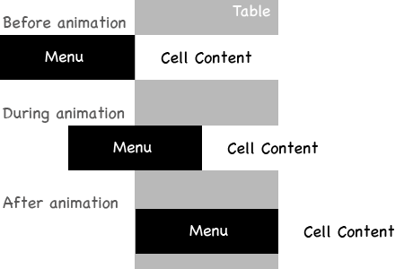
As you can see in the image at the top of this post, we are animating the existing cell content offscreen while simultaneously animating in the menu. Here is a rough illustration of how both the cell content and the menu have to animate in sync during a left to right animation:

So we first set the frame of the menu, placing it offscreen. Depending of the direction, we’d put it offscreen on the right or left side of the table. Next we’d start an animation block and set the frame of the menu to be at 0 x-offset. Inside the same animation block we also set the cell’s frame to be offscreen on the other side of the table.

- (void) addSwipeViewTo:(UITableViewCell*)cell direction:(UISwipeGestureRecognizerDirection)direction
{
  // Change the frame of the side swipe view to match the cell
  sideSwipeView.frame = cell.frame;

  // Add the side swipe view to the table
  [tableView addSubview:sideSwipeView];
  
  // Remember which cell the side swipe view is displayed on and the swipe direction
  self.sideSwipeCell = cell;
  sideSwipeDirection = direction;

  // Move the side swipe view offscreen either to the left or the right depending on the swipe direction
  CGRect cellFrame = cell.frame;
  sideSwipeView.frame = CGRectMake(direction == UISwipeGestureRecognizerDirectionRight ? -cellFrame.size.width : cellFrame.size.width, cellFrame.origin.y, cellFrame.size.width, cellFrame.size.height);

  // Animate in the side swipe view
  animatingSideSwipe = YES;
  [UIView beginAnimations:nil context:nil];
  [UIView setAnimationDuration:0.2];
  [UIView setAnimationDelegate:self];
  [UIView setAnimationDidStopSelector:@selector(animationDidStopAddingSwipeView:finished:context:)];
  // Move the side swipe view to offset 0
  sideSwipeView.frame = CGRectMake(0, cellFrame.origin.y, cellFrame.size.width, cellFrame.size.height);
  // While simultaneously moving the cell's frame offscreen
  // The net effect is that the side swipe view is pushing the cell offscreen
  cell.frame = CGRectMake(direction == UISwipeGestureRecognizerDirectionRight ? cellFrame.size.width : -cellFrame.size.width, cellFrame.origin.y, cellFrame.size.width, cellFrame.size.height);
  [UIView commitAnimations];
}

Animating out the menu view

When the menu is animated away, there is a little bounce of the cell content as it comes back into view.

Here is another rough illustration showing the three animations that make up a bounce, showing at each step where the cell content and menu are:

There are multiple ways we can achieve this animation. One is CAKeyframeAnimation where you specify a path and the animation follows that path.

Instead the code simply chains together the 3 separate animations. Since we might care about iOS 3, we don’t use animation blocks, but instead use begin/commit animation methods and register an animation stop selector where we start the next animation.

Just like we did when animating the menu in, at each step we animate both the menu as well as the cell to give the illusion that the cell content is pushing the menu out of view.

UPDATE: It was pointed out on Hacker News that the Twitter app actually puts the menu behind the cell and then only animates the cell content in and out. The menu isn’t animated at all. I’ve updated the code so that by default it now does this style of animation. If you really liked the pushing behavior where both the menu and cell content are animated, there is a PUSH_STYLE_ANIMATION #define that you can set to YES to get it back.

Full Source code: https://github.com/boctor/idev-recipes/tree/master/SideSwipeTableView

Tweet This!Hacker NewsShare on Facebook


Last week WordPress founding developer Matt Mullenweg was interviewed by John Battelle at SXSW where he was startlingly candid about the shortcomings of WordPress’s iPhone app

“Twitter inspired us to start taking mobile seriously,” he added. “You open it [Twitter’s app] at any time and instantly start reading your friends’ tweets. If you open our app you get a blank screen.”
Mullenweg was startlingly candid about the shortcomings of WordPress’s iPhone app, which he described as “not good yet.” His engineers are working to improve it, he added.

Not Good Yet

I’m a big WordPress fan, having used it for years on my personal blog and more recently here on iDevRecipes. I tried the WordPress iPhone app a while back and I’d wholeheartedly agree with Matt that it’s “not good yet.”

Now just as Matt said, the WordPress Mobile team is working on it. Just yesterday, they released version 2.7 of the app with over 100 bug fixes and UI improvements like pull to refresh.

Making it Great

But Matt’s comments got me thinking on how to make the WordPress app really great. Most iPhone apps initially focus on content consumption with a splash of account management. The thinking is that users are much more likely to consume on these devices.

The WordPress app is actually open sourced and you can see that it uses the WordPress XML-RPC API which predated the iPhone to let you manage your blog.

I think this XML-RPC API nudged the WordPress iPhone app towards a full blown account management app. But where is the content consumption? (reading the comments on your posts doesn’t count!)

Reimagined Around Content Consumption

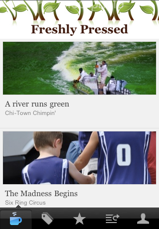
So my first thought was to reimagine the app around content consumption. WordPress.com has a bunch of great curated content. They highlight posts in their Freshly Pressed section and they categorize blogs based on tags.

A little sketching, thinking and poking around WordPress.com and here is what I came up with:

  • First convert the app to a tab based app
  • Fill the first tab with the Freshly Pressed content
  • Fill the second tab with Tags, letting you explore the tags and then see blogs associated with each tag
  • In the third tab put Posts I like. You’d be able to add to this list either on WordPress.com or by liking posts from within the app
  • In the fourth tab put Subscriptions, letting you see the newest posts from the blogs that you subscribe to (Subscriptions are like RSS feeds for non-techies)
  • Take the existing app and put it under a My Blogs tab at the end of the tab bar

Prototype Implementation

Of course this is an iOS development blog, and we can’t have a post without code! So I implemented the first two items in the list. Using our previous Twitter custom tab bar recipe I converted the main view of the app to be tab bar based app. Next I added the Freshly Pressed content to the first tab.

Freshly Pressed

Normally when displaying existing content in an iPhone app, you can’t go wrong with RSS feeds. Freshly Pressed has an RSS feed, but it just displays the first page of content. Also, the image for each featured post is offset using a background-position CSS property that the RSS feed doesn’t expose.

Scraping

So I did what seemed reasonable at the time: I wrote a ruby script that scraped the Freshly Pressed pages and put some JSON up on S3. Now keep in mind that we’re just experimenting here and we can easily swap this scraping out for a real Freshly Pressed API.

Some interesting things about the ruby script: The images uses either a WordPress image server to resize the original images or an imgpress WordPress service to convert the blog home page to an image, and in both cases I change the width from the 223 pixels the web site uses to 320 pixels so the images look nice on the iPhone. After increasing the size from 223 to 320, I also have to increase the pixel offset for each image. For example, if the offset was -30 pixels for the original image, then the offset for the new image is -30 * (320/223).

Without a real design, my first cut iteration of the table view cells is to mirror the look of the web site, including the colors, fonts and general layout

Tapping on each cell loads the blog post in a UIWebView

What do you think?

If you were to imagine a really great WordPress iPhone app, what would you come up with?
Are there things about this design/implementation you like/don’t like?

Let me know in the comments!

Full Source code: https://github.com/boctor/idev-recipes/tree/master/WordPressReimagined

Tweet This!Hacker NewsShare on Facebook

Full Source code: https://github.com/boctor/idev-recipes/tree/master/CustomTabBarNotification

Problem:

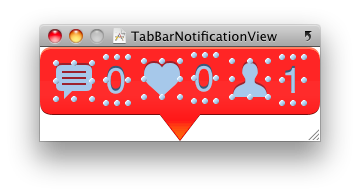
When the Instagram app wants to let you know that you have new comments, likes or followers, it doesn’t use standard badge values on tab bar items:

Instead it uses a custom tab bar notification view. How do we build a similar custom notification view?

Solution:

Just like in our recipe for the Twitter app’s current tab bar indicator we will add a view on top of the tab bar to notify the user. Instead of a static image, we will add a slightly more complicated view. This view has the background, icons for each of the activities (comments, likes, followers), and labels with the number value of each of these activities. Here is what it looks like laid out in the NIB:

Vertical/Horizontal Location

Again we need to figure out the horizontal and vertical location of our custom view and we essentially do the same thing we did in our Twitter tab bar indicator recipe:

To calculate the vertical location, we start at the top of the tab bar (0), go up by the height of the notification view, then go up another 2 pixels so our view is slightly above the tab bar

For the horizontal location we divide the width of the tab bar by the number of items to calculate the width of a single item. We then multiply the index by the width of single item and add half the width of an item to land in the middle.

Showing/Hiding the custom notification view

In a real app we would hit a web service, get the data and then notify the user by showing the custom notification UI.

In the sample app we have a couple of buttons that show and hide the notification view. We also do a very simple fade in/fade out animation of the notification view.

Showing the custom notification view:

- (void) showNotificationViewFor:(NSUInteger)tabIndex
{
  // To get the vertical location we start at the top of the tab bar (0), go up by the height of the notification view, then go up another 2 pixels so our view is slightly above the tab bar
  CGFloat verticalLocation = - notificationView.frame.size.height - 2.0;
  notificationView.frame = CGRectMake([self horizontalLocationFor:tabIndex], verticalLocation, notificationView.frame.size.width, notificationView.frame.size.height);

  if (!notificationView.superview)
    [self.tabBar addSubview:notificationView];

  notificationView.alpha = 0.0;

  [UIView beginAnimations:nil context:nil];
  [UIView setAnimationDuration:0.5];
  notificationView.alpha = 1.0;
  [UIView commitAnimations];
}

Hiding the custom notification view:

- (IBAction)hideNotificationView:(id)sender
{
  [UIView beginAnimations:nil context:nil];
  [UIView setAnimationDuration:0.5];
  notificationView.alpha = 0.0;
  [UIView commitAnimations];
}

In the end the solution is quite simple: A custom view laid out in a NIB, added to the view hierarchy at the right location. But it definitely looks sexier than the built in red badge.

What do you think? Can you make this code better? Let us know in the comments!

Full Source code: https://github.com/boctor/idev-recipes/tree/master/CustomTabBarNotification

Tweet This!Hacker NewsShare on Facebook

Sometimes it’s useful to quickly see all the subviews of a UIView.

Perhaps you’re debugging a problem in one of your views or trying to understand the inner workings of one of the built in views.

You can simply iterate over a view’s subviews, but then you won’t see subviews deeper than one level. You need a method that recursively walks the hierarchy.

Luckily Apple has already done this with the recursiveDescription method, part of a UIDebugging category on UIView.

recursiveDescription was recently documented in a tech note titled iOS Debugging Magic.

At the gdb prompt in the Xcode debugger you can say:

(gdb) po [[self view] recursiveDescription]

and instantly see a description of the entire view hierarchy. We used this in our Transparent UIWebViews recipe to figure out the view hierarchy of a UIWebView:

(gdb) po [webView recursiveDescription]
<UIWebView: 0x68220e0; frame = (0 0; 320 460); >
| <UIScrollView: 0x4b2bee0; frame = (0 0; 320 460); >
|    | <UIImageView: 0x4b2dca0; frame = (0 0; 54 54); >
|    | <UIImageView: 0x4b2da20; frame = (0 0; 54 54); >
|    | <UIImageView: 0x4b2d9c0; frame = (0 0; 54 54); >
|    | <UIImageView: 0x4b12030; frame = (0 0; 54 54) >
|    | <UIImageView: 0x4b11fd0; frame = (-14.5 14.5; 30 1); >
|    | <UIImageView: 0x4b11f70; frame = (-14.5 14.5; 30 1); >
|    | <UIImageView: 0x4b11f10; frame = (0 0; 1 30); >
|    | <UIImageView: 0x4b11eb0; frame = (0 0; 1 30); >
|    | <UIImageView: 0x4b11e50; frame = (0 430; 320 30); >
|    | <UIImageView: 0x4b2d0c0; frame = (0 0; 320 30);  >
|    | <UIWebBrowserView: 0x6005800; frame = (0 0; 320 460); >

Tweet This!Hacker NewsShare on Facebook

Full Source code: https://github.com/boctor/idev-recipes/tree/master/CustomBackButton

Problem:

Apps like Instagram, Reeder and DailyBooth have a UINavigationBar with custom background and sometimes custom back buttons. How do we build a similar custom UINavigationBar?

Solution:

In our recipe for Recreating the iBooks wood themed navigation bar we added a wood  image as a subview of UINavigationBar. This worked but it turns out that we were lucky.

If we had tried to push another view controller onto our UINavigationController we would’ve ended up with a UINavigationBar that has nothing but our wood image. This is because as the standard UINavigationBar implementation adds items, it also then sends them to the back of its view hierarchy. So even if we add our custom image to the bottom of the UINavigationBar view hierarchy, the rightBarButtonItem, titleView and leftBarButtonItem end up below the custom image and out of sight.

The nav bar background

We need a new, more flexible solution: Instead of adding to a UINavigationBar’s view hierarchy we will subclass UINavigationBar. We’ll override UINavigationBar’s drawRect and draw our custom background image directly:

// If we have a custom background image, then draw it, othwerwise call super and draw the standard nav bar
- (void)drawRect:(CGRect)rect
{
  if (navigationBarBackgroundImage)
    [navigationBarBackgroundImage.image drawInRect:rect];
  else
    [super drawRect:rect];
}

Any time navigationBarBackgroundImage changes we also need to call [self setNeedsDisplay] so the new background image is properly drawn.

A couple of methods allow us to set or clear the background image:

// Save the background image and call setNeedsDisplay to force a redraw
-(void) setBackgroundWith:(UIImage*)backgroundImage
{
  self.navigationBarBackgroundImage = [[[UIImageView alloc] initWithFrame:self.frame] autorelease];
  navigationBarBackgroundImage.image = backgroundImage;
  [self setNeedsDisplay];
}

// clear the background image and call setNeedsDisplay to force a redraw
-(void) clearBackground
{
  self.navigationBarBackgroundImage = nil;
  [self setNeedsDisplay];
}

Multiple nav bar backgrounds

In most cases, you’ll have a single custom background image that you’ll set once.

If you need to change the custom background more than once, say every time the user enters a new section, then simply call setBackgroundWith every time you want the nav bar’s background to change.

The source code for this recipe is one app with a single UINavigationController and a table row for each of the apps: InstagramReeder and DailyBooth. When you select a row, we push a view controller that calls setBackgroundWith to set the background image for each app.

Custom back button

In the iBooks recipe we created a custom UIBarButtonItem by creating a button with a stretchable image and adding the button as the customView of UIBarButtonItem.

We do the same thing here except we use an image has an arrow on the left side and we adjust the button’s titleEdgeInsets to center the text properly.

The backButtonWith:highlight:leftCapWidth: convenience method on our CustomNavigationBar class creates a back button which we can then add as the leftBarButtonItem. This replaces the built in back button.

To resize our custom back button to match width of the text, we use UILabel’s sizeWithFont to measure the width of the text and resize the button appropriately.

Trying it out

Just like the standard back bar button implementation, the CustomNavigationBar will set the title of the back button to the title of the previous controller on the UINavigationController stack.

The source code for this recipe also lets you dynamically change the back button text after a view controller is pushed onto the UINavigationController stack. The back button resizes as needed and you get to see and experiment with different text and button widths.

Full Source code: https://github.com/boctor/idev-recipes/tree/master/CustomBackButton

Tweet This!Hacker NewsShare on Facebook

Full Source code: https://github.com/boctor/idev-recipes/tree/master/CustomTabBar

Problem:

The Twitter iPhone App has a custom tab bar that is shorter than the standard tab bar, doesn’t have titles for the tab bar items and has a blue glow indicating when a section has new content. We want to recreate this custom tab bar.

Solution:

Just like segmented controls, the best way to customize the tab bar is to build it from scratch. In fact we’re going to start by using a recipe similar to what we used for custom segment controls:

  • Create a button for every tab bar item.
  • Manage the touches on the buttons so when one is selected, the others are deselected.

But how do we recreate the look of the buttons and how about that nice background for the tab bar?

The tab bar background

Looking at the images of the Twitter app, we find the TabBarGradient.png image which is 22px, exactly half the 44px height of this custom tab bar.

Taking a screenshot of the Twitter app and looking at it carefully reveals how the background is built:

  • The top half is a stretchable image of TabBarGradient.png
  • The bottom half is simply solid black

The custom tab bar asks its delegate for the background image and here is how we build it:

// Get the image that will form the top of the background
UIImage* topImage = [UIImage imageNamed:@"TabBarGradient.png"];

// Create a new image context
UIGraphicsBeginImageContextWithOptions(CGSizeMake(width, topImage.size.height*2), NO, 0.0);

// Create a stretchable image for the top of the background and draw it
UIImage* stretchedTopImage = [topImage stretchableImageWithLeftCapWidth:0 topCapHeight:0];
[stretchedTopImage drawInRect:CGRectMake(0, 0, width, topImage.size.height)];

// Draw a solid black color for the bottom of the background
[[UIColor blackColor] set];
CGContextFillRect(UIGraphicsGetCurrentContext(), CGRectMake(0, topImage.size.height, width, topImage.size.height));

// Generate a new image
UIImage* resultImage = UIGraphicsGetImageFromCurrentImageContext();
UIGraphicsEndImageContext();

return resultImage;

The buttons

The buttons have the following visual states:

  • Drawn in gray when unselected
  • Drawn with blue gradient when selected
  • Embossed border is drawn around the selected item

A button has both an image and a background image and they can both be set for the various control states. When a button is selected, the blue gradient appears to be on top and the embossed border is behind it. So here is how we’ll setup the button:

  • The button’s image for the normal state will be gray
  • The button’s image for the selected/highlighted state will be blue
  • The button’s background image for the selected/highlighted state will be the embossed border

The images for the tab bar items

A standard UITabBar only uses the alpha values of the tab bar item images. It doesn’t matter what color the images are, they will always appear in gray and blue. For our custom tab bar to be truly reusable, it will need to do the same thing.

But how exactly do we do this? It takes several steps:

  1. First we take the image and use CGContextClipToMask to generate a new image that has a white background and black content:
  2. Next we take this black and white image and use CGImageMaskCreate to create an image mask.
  3. Finally we combine the image mask with a background color.

For every tab bar item we generate two images: one with a solid gray background and another with a blue gradient background.

The blue glow

The blue glow is an image that is simply added to each button as a subview. In the Twitter app, a tab bar item will get a blue glow after the app has downloaded new content. It is a visual cue that there is more content in that section.

Our custom tab bar asks its delegate for the glowImage and it exposes a couple of methods to manage the glow: glowItemAtIndex and removeGlowAtIndex.

The current tab bar indicator

When a tab bar item is selected, a triangle at the top of the tab bar animates into place. We covered this animation in an earlier post. We use the code from that post to get the same animation for the custom tab bar.

Full Source code: https://github.com/boctor/idev-recipes/tree/master/CustomTabBar

Tweet This!Hacker NewsShare on Facebook

Full Source code: https://github.com/boctor/idev-recipes/tree/master/VerticalSwipeArticles

Problem:

The Reeder iPhone App lets you pull up to see the title of the next article. If you pull up far enough the arrow rotates and the next article animates into view. We want to recreate this UI.

Solution:

If you don’t pull up far enough, the article bounces back into view and that is a very strong clue that we are dealing with a UIScrollView.

A UIScrollView is used to display content that is larger than the application’s window. You tell it the contentSize of your content and it manages scrolling within the content. When you get to the edge of the content, the scroll view bounces to let you know you’ve reached the edge.

The header and footer views

Normally when you pull up at the edge of a scroll view empty space appears, but in the Reeder app, the title of the next article appears along with an arrow. To recreate this we’ll create a scroll view with a contentSize that is the same as the scroll view. Then we’ll tell the scroll view to alwaysBounceVertical. This causes a view that bounces vertically when you pull up or down.

Next we’ll add a header view as the subview of the scroll view and set it’s frame to be right above the scroll view and we’ll add a footer view as the subview of the scroll view and set it’s frame to be right below the scroll view. The header and footer are offscreen but when you pull up or down, they get pulled into view.

Subclassing UIScrollView

In addition to trying to figure out how to recreate the feature, we need to also figure out how to structure our code. The most reusable part of this feature is the ability to swipe up and down to see another article while seeing a preview of the previous/next article. We’ve already determined that we’ll be using a scroll view that we’ve customized so it seems logical that we would create a subclass of UIScrollView.

Animating the header and footer views

The arrows in the header and footer rotate to let the user know that when they lift their finger, the previous/next article will be shown. When the view has been scrolled past some distance we need to trigger this arrow rotation.

To accomplish this we will listen to the UIScrollViewDelegate’s scrollViewDidScroll message and check the scroll view’s contentOffset. This means that our UIScrollView subclass will have itself as its delegate. This sounds odd but works just fine.

Our subclass will send out 4 messages:

  • headerLoadedInScrollView
  • headerUnloadedInScrollView
  • footerLoadedInScrollView
  • footerUnloadedInScrollView

A header/footer is loaded when the user pulls down or up past the height of the header/footer. It is unloaded when they pull back and hide part of the header/footer. So with one arrow image, this is how we animate the arrow rotation:

- (void) rotateImageView:(UIImageView*)imageView angle:(CGFloat)angle
{
  [UIView beginAnimations:nil context:nil];
  [UIView setAnimationDuration:0.2];
  imageView.transform = CGAffineTransformMakeRotation(DegreesToRadians(angle));
  [UIView commitAnimations];
}
-(void) headerLoadedInScrollView:(VerticalSwipeScrollView*)scrollView
{
  [self rotateImageView:headerImageView angle:0];
}

-(void) headerUnloadedInScrollView:(VerticalSwipeScrollView*)scrollView
{
  [self rotateImageView:headerImageView angle:180];
}

-(void) footerLoadedInScrollView:(VerticalSwipeScrollView*)scrollView
{
  [self rotateImageView:footerImageView angle:180];
}

-(void) footerUnloadedInScrollView:(VerticalSwipeScrollView*)scrollView
{
  [self rotateImageView:footerImageView angle:0];
}

Animating the previous and next page

The UIScrollViewDelegate’s scrollViewDidEndDragging message lets us know when the user has lifted their finger after dragging. To animate the next page, we place the page below the footer and inside of an animation block place it on screen. This results in a nice up animation.

if (_footerLoaded) // If the footer is loaded, then the user wants to go to the next page
{
  // Ask the delegate for the next page
  UIView* nextPage = [externalDelegate viewForScrollView:self atPage:currentPageIndex+1];
  // We want to animate this new page coming up, so we first
  // Set its frame to the bottom of the scroll view
  nextPage.frame = CGRectMake(0, nextPage.frame.size.height + self.contentOffset.y, self.frame.size.width, self.frame.size.height);
  [self addSubview:nextPage];

  // Start the page up animation
  [UIView beginAnimations:nil context:nextPage];
  [UIView setAnimationDuration:0.2];
  [UIView setAnimationDelegate:self];
  [UIView setAnimationDidStopSelector:@selector(pageAnimationDidStop:finished:context:)];
  // When the animation is done, we want the next page to be front and center
  nextPage.frame = self.frame;
  // We also want the existing page to animate to the top of the scroll view
  currentPageView.frame = CGRectMake(0, -(self.frame.size.height + headerView.frame.size.height), self.frame.size.width, self.frame.size.height);
  // And we also animate the footer view to animate off the top of the screen
  footerView.frame = CGRectMake(0, -footerView.frame.size.height, footerView.frame.size.width, footerView.frame.size.height);
  [UIView commitAnimations];

  // Increment our current page
  currentPageIndex++;
}

We also register a callback for when this animation is done and make sure our header and footer are in place for the next time the user pulls the scroll view up or down.

UIWebViews are unique

Our UIScrollView subclass calls the delegate’s viewForScrollView:atPage to get the actual pages. Life would be simple if we could return a static page like say an image, but in the real world it is more likely that you will be returning a UIWebView to accommodate things like titles that may wrap.

The sample app uses a JSON feed of the top paid apps in the App Store and uses a UIWebView to display each page.

No matter how simple the html that you are displaying in a UIWebView, the rendering will not be instantaneous and there will always be an overhead of setting up the UIWebView. If every time viewForScrollView:atPage is called you created a new  UIWebView with html, then as this page is getting animated into view, the rendering will not have completed. The net result will be that the scroll animation will show a blank white page instead of the actual content.

To deal with this the sample app keeps around a previousPage and nextPage UIWebViews. When asked for page 1, the sample preloads previousPage with page 0 and nextPage with page 2. If there are other caching techniques you think would work here, please share your thoughts in the comments.

Full Source code: https://github.com/boctor/idev-recipes/tree/master/VerticalSwipeArticles

Tweet This!Hacker NewsShare on Facebook